Flutter로 개발하기(27) - 레이아웃 위젯 목록
참고
- https://flutter.dev/docs/development/ui/widgets/layout
- https://api.flutter.dev/flutter/widgets/widgets-library.html
- https://medium.com/flutter-community/flutter-layout-cheat-sheet-5363348d037e
multi-child 레이아웃 위젯
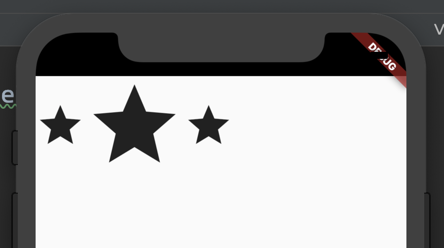
Row
수평으로 자식들을 배치합니다. Row의 height는 자식들의 height들 중에서 가장 긴 height에 맞춰집니다.
기본값
- mainAxisSize: max
- mainAxisAlignment: start
- crossAxisAlignment: center
Scaffold(
  body: Row(
    children: <Widget>[
      Icon(Icons.star, size: 50),
      Icon(Icons.star, size: 100),
      Icon(Icons.star, size: 50),
    ],
  ),
)
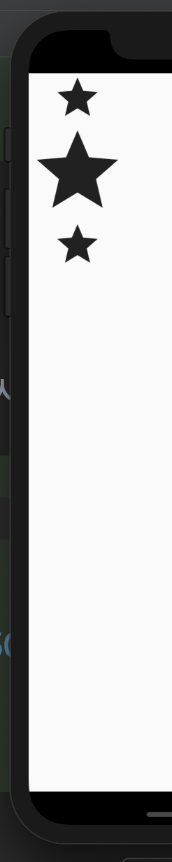
Column
수직으로 자식들을 배치합니다. Column의 width는 자식들의 width들 중에서 가장 긴 width에 맞춰집니다.
기본값
- mainAxisSize: max
- mainAxisAlignment: start
- crossAxisAlignment: center
Scaffold(
  body: Column(
    children: <Widget>[
      Icon(Icons.star, size: 50),
      Icon(Icons.star, size: 100),
      Icon(Icons.star, size: 50),
    ],
  ),
)
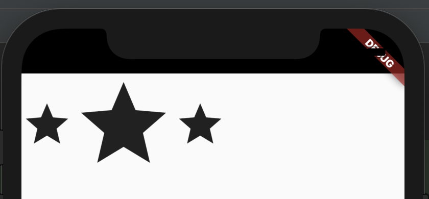
Flex
Row, Column의 조상 클래스. direction 속성값에 따라 Row 또는 Column의 특성을 가집니다.
Scaffold(
  body: Flex(
    direction: Axis.horizontal,
    children: <Widget>[
      Icon(Icons.star, size: 50),
      Icon(Icons.star, size: 100),
      Icon(Icons.star, size: 50),
    ],
  ),
)
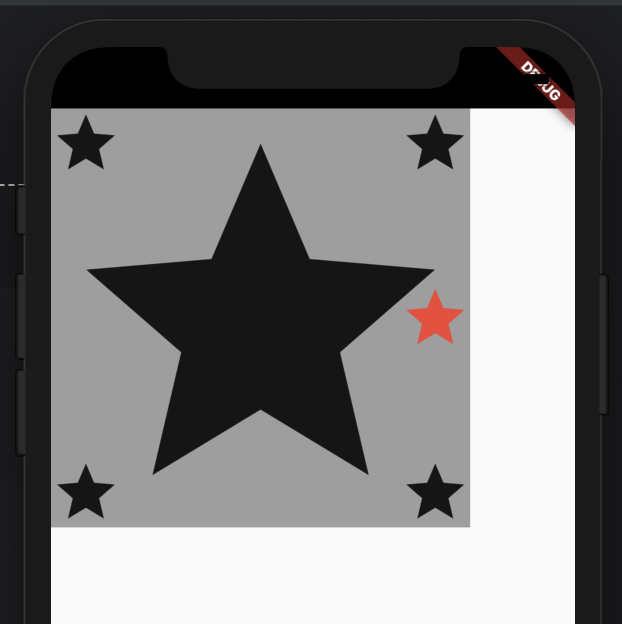
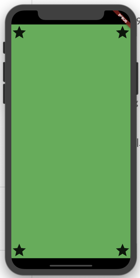
Stack
자식들을 쌓아서 배치합니다. Stack의 크기는 자식들의 크기 중 가장 큰 크기에 맞춰집니다.
Scaffold(
  body: DecoratedBox(
    decoration: BoxDecoration(color: Colors.grey),
    child: Stack(
      alignment: Alignment.centerRight,
      children: <Widget>[
        Icon(Icons.star, size: 300), // largest child
        Icon(Icons.star, size: 50, color: Colors.red), // align center right
        Positioned(left: 0, top: 0, child: Icon(Icons.star, size: 50)), // positioned left, top
        Positioned(right: 0, top: 0, child: Icon(Icons.star, size: 50)), // positioned right, top
        Positioned(left: 0, bottom: 0, child: Icon(Icons.star, size: 50)), // positioned left, bottom
        Positioned(right: 0, bottom: 0, child: Icon(Icons.star, size: 50)), // positioned right, bottom
      ],
    ),
  ),
)
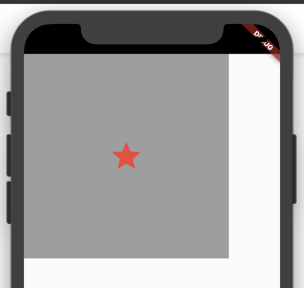
IndexedStack
Stack과 같은 특성을 가지지만 설정된 index에 해당하는 자식만 보여줍니다. IndexedStack의 크기는 자식들의 크기 중 가장 큰 크기에 맞춰집니다.
Scaffold(
  body: DecoratedBox(
    decoration: BoxDecoration(color: Colors.grey),
    child: IndexedStack(
      index: 1,
      alignment: FractionalOffset(0.5, 0.5),
      children: <Widget>[
        Icon(Icons.star, size: 300), // largest child
        Icon(Icons.star, size: 50, color: Colors.red), // align center right
        Positioned(left: 0, top: 0, child: Icon(Icons.star, size: 50)), // positioned left, top
        Positioned(right: 0, top: 0, child: Icon(Icons.star, size: 50)), // positioned right, top
        Positioned(left: 0, bottom: 0, child: Icon(Icons.star, size: 50)), // positioned left, bottom
        Positioned(right: 0, bottom: 0, child: Icon(Icons.star, size: 50)), // positioned right, bottom
      ],
    ),
  ),
)
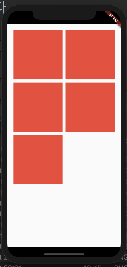
GridView
자식들을 2차원 배열로 배치할 수 있고 스크롤 할 수 있습니다. mainAxis에 따라 스크롤 배치, 스크롤 방향이 결정됩니다. GridView.count 생성자는 crossAxis 방향의 타일수를 고정한 채로 GridView를 생성합니다. GridView.extend 생성자는 설정된 maxCrossAxisExtent값으로 타일당 크기를 제한해서 crossAxis 방향으로 가능한 한 많은 타일수를 가지게 합니다. SliverGridDelegate를 사용하면 자식들과 함께 정렬되지 않거나 겹치는 위젯을 포함시킬 수 있습니다. GridView.builder 생성자는 인피니티 GridView를 만들 수 있게 해줍니다.
Scaffold(
  body: GridView.count(
    primary: false,
    padding: const EdgeInsets.all(20.0),
    crossAxisSpacing: 10.0,
    mainAxisSpacing: 10.0,
    crossAxisCount: 2,
    children: <Widget>[
      Container(color: Colors.red),
      Container(color: Colors.red),
      Container(color: Colors.red),
      Container(color: Colors.red),
      Container(color: Colors.red),
    ],
  ),
)
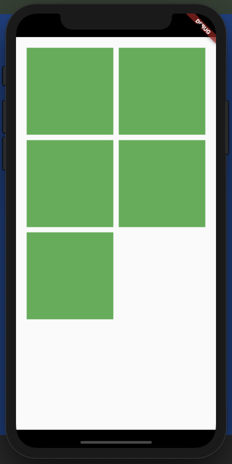
Gridview.extend 사용:
Scaffold(
  body: GridView.extent(
    primary: false,
    padding: const EdgeInsets.all(20.0),
    maxCrossAxisExtent: 300,
    crossAxisSpacing: 10.0,
    mainAxisSpacing: 10.0,
    children: <Widget>[
      Container(color: Colors.green),
      Container(color: Colors.green),
      Container(color: Colors.green),
      Container(color: Colors.green),
      Container(color: Colors.green),
    ],
  ),
)
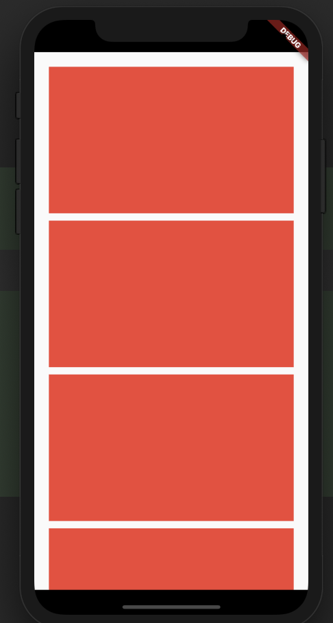
ListView
자식들을 수직 또는 수평 방향으로 배치할 수 있고 스크롤 할 수 있습니다.
자식의 라이프사이클 자식이 리스트 밖으로 나갈 때 자식의 상태와 렌더객체는 lazy하게 삭제됩니다. 자식이 리스트 안으로 들어올 때도 자식의 상태와 렌더객체는 lazy하게 생성됩니다.
Scaffold(
  body: ListView.builder(
    scrollDirection: Axis.vertical,
    padding: EdgeInsets.all(20),
    itemBuilder: (BuildContext context, int index) {
      return Container(width: 200, height: 200, margin: EdgeInsets.only(bottom: 10), color: Colors.red);
    },
  ),
)
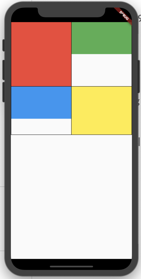
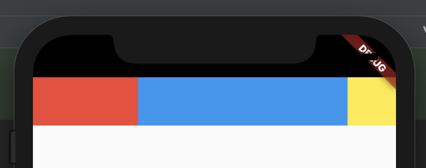
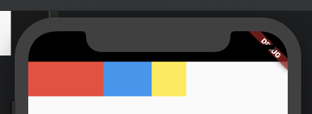
Table
테이블 레이아웃 알고리즘을 사용하는 위젯
Scaffold(
  body: Table(
    border: TableBorder.all(),
    children: <TableRow>[
      TableRow(children: <Widget>[
        TableCell(child: Container(width: double.infinity, height: 200, color: Colors.red)),
        TableCell(child: Container(width: double.infinity, height: 100, color: Colors.green)),
      ]),
      TableRow(children: <Widget>[
        TableCell(child: Container(width: double.infinity, height: 100, color: Colors.blue)),
        TableCell(child: Container(width: double.infinity, height: 150, color: Colors.yellow)),
      ])
    ],
  ),
)
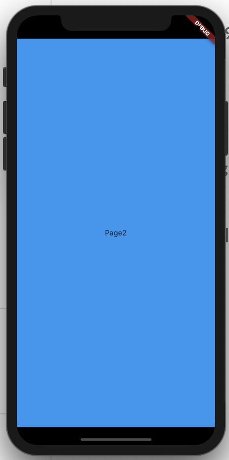
PageView
스크롤해서 페이지를 넘길 수 있는 위젯. 각 자식은 viewport로써 같은 사이즈로 강제됩니다. PageController와 함께 사용합니다.
Scaffold(
  body: PageView(
    children: <Widget>[
      Container(
        color: Colors.red,
        child: Center(child: Text('Page1')),
      ),
      Container(
        color: Colors.blue,
        child: Center(child: Text('Page2')),
      ),
      Container(
        color: Colors.green,
        child: Center(child: Text('Page3')),
      ),
    ],
  ),
)
Wrap
자식들을 수평 또는 수직으로 배치합니다. 자식을 배치할 공간이 부족하면 자식을 다음 줄에 배치합니다.
Scaffold(
  body: DecoratedBox(
    decoration: BoxDecoration(color: Colors.grey),
    child: Wrap(
      direction: Axis.horizontal,
      spacing: 10,
      runSpacing: 40,
      children: <Widget>[
        Container(width: 100, height: 100,color: Colors.black),
        Container(width: 100, height: 100,color: Colors.black),
        Container(width: 100, height: 100,color: Colors.black),
        Container(width: 100, height: 100,color: Colors.black),
      ],
    ),
  ),
)
Flow
참고: https://medium.com/flutter-community/advanced-flutter-layout-flow-32300bf3b7b3
Wrap의 조상 클래스. 자식들의 크기와 위치를 FlowDelegate를 통해 효과적으로 설정할 수 있습니다. transformation을 사용한 repositioning에 최적화돼있습니다. 자식들을 transformation하는 애니메이션이 실행되는 동안 Flow는 자신을 repaint해서 자식들의 위치나 크기가 바뀌는 것처럼 그릴 뿐 자식들의 실제 위치를 변경시키는 것이 않으므로 성능을 끌어올립니다.
LayoutBuilder
Container(
    color: Colors.green,
    child: LayoutBuilder( // LayoutBuilder
      builder: (context, constraints) {
        return Stack(
          children: <Widget>[
            Positioned(left: 0, top: 0, child: Icon(Icons.star, size: 50)), // left, top
            Positioned(left: constraints.maxWidth - 50, top: 0, child: Icon(Icons.star, size: 50)), // left, top
            Positioned(left: 0, top: constraints.maxHeight - 50, child: Icon(Icons.star, size: 50)), // left, top
            Positioned(left: constraints.maxWidth - 50, top: constraints.maxHeight - 50, child: Icon(Icons.star, size: 50)), // left, top
          ],
        );
      },
    ),
  )
single-child 레이아웃 위젯
Expanded
Row, Column, Flex에서 mainAxis 방향으로 남은 공간 만큼 자식의 크기를 확장시킵니다.
Scaffold(
  body: Row(
    children: <Widget>[
      Expanded(flex: 1, child: Container(color: Colors.red, height: 50)),
      Expanded(flex: 2, child: Container(color: Colors.blue, height: 50)),
      Container(color: Colors.yellow, width: 50, height: 50),
    ],
  ),
)
Flexible
Expanded의 조상 클래스. fit 속성을 설정할 수 있으며 속성값이 FlexFit.loose일 경우엔 설정된 크기보다 더 커질 수 없도록 크기에 제한이 걸립니다.
Scaffold(
  body: Row(
    children: <Widget>[
      Expanded(
          flex: 1, child: Container(color: Colors.red, height: 50)),
      Flexible(
          fit: FlexFit.loose,
          flex: 2,
          child: Container(color: Colors.blue, width: 70, height: 50)), // width가 최대 70으로 제한됨.
      Container(color: Colors.yellow, width: 50, height: 50),
    ],
  ),
)
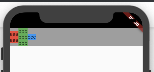
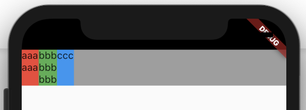
IntrinsicHeight
자식의 크기를 자식의 본질적인 크기로 만들어줍니다. 예를 들면 아래와 같습니다.
IntrinsicHeight 사용 전:
Scaffold(
  body: DecoratedBox(
    decoration: BoxDecoration(color: Colors.grey),
    child: Row(
      children: <Widget>[
        DecoratedBox(
          decoration: BoxDecoration(color: Colors.red),
          child: Text('aaa\naaa'),
        ),
        DecoratedBox(
          decoration: BoxDecoration(color: Colors.green),
          child: Text('bbb\nbbb\nbbb'),
        ),
        DecoratedBox(
          decoration: BoxDecoration(color: Colors.blue),
          child: Text('ccc'),
        ),
      ],
    ),
  ),
)
IntrinsicHeight 사용 후:
Scaffold(
  body: IntrinsicHeight(
    child: DecoratedBox(
      decoration: BoxDecoration(color: Colors.grey),
      child: Row(
        crossAxisAlignment: CrossAxisAlignment.stretch,
        children: <Widget>[
          DecoratedBox(
            decoration: BoxDecoration(color: Colors.red),
            child: Text('aaa\naaa'),
          ),
          DecoratedBox(
            decoration: BoxDecoration(color: Colors.green),
            child: Text('bbb\nbbb\nbbb'),
          ),
          DecoratedBox(
            decoration: BoxDecoration(color: Colors.blue),
            child: Text('ccc'),
          ),
        ],
      ),
    ),
  ),
)
이 위젯은 처리비용이 매우 비싸므로 지양해야 합니다.
IntrinsicWidth
IntrinsicHeight에서 방향만 다른 특성을 가집니다.
Scaffold(
  body: IntrinsicWidth(
    child: DecoratedBox(
      decoration: BoxDecoration(color: Colors.grey),
      child: Column(
        crossAxisAlignment: CrossAxisAlignment.stretch,
        children: <Widget>[
          DecoratedBox(
            decoration: BoxDecoration(color: Colors.red),
            child: Text('aaaaaa'),
          ),
          DecoratedBox(
            decoration: BoxDecoration(color: Colors.green),
            child: Text('bbbbbbbbb'),
          ),
          DecoratedBox(
            decoration: BoxDecoration(color: Colors.blue),
            child: Text('ccc'),
          ),
        ],
      ),
    ),
  ),
)
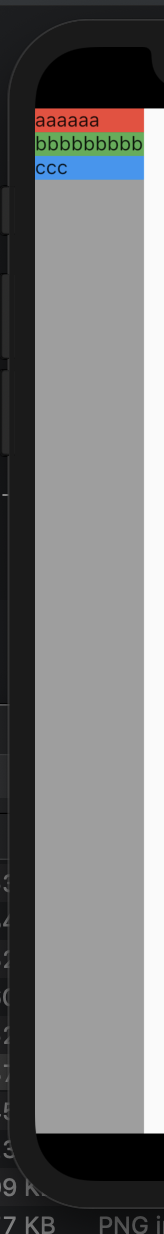
이 위젯은 처리비용이 매우 비싸므로 지양해야 합니다.
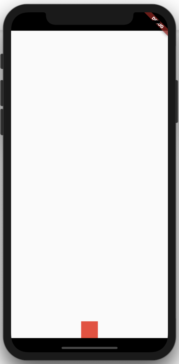
Align
Align의 부모의 영역 안에서 Align의 자식을 정렬시킵니다.
alignment 속성을 가지는 위젯 어느 곳에서든 alignment 속성에 FractionalOffset을 설정하면 자식을 원하는 퍼센테이지 위치로 정렬시킬 수 있습니다. 예를 들면 아래와 같습니다.
Scaffold(
  body: Align(
    alignment: FractionalOffset(0.5, 1.0), // 수평 중간, 수직 하단에 위치하도록 설정
    child: Container(
      height: 40.0,
      width: 40.0,
      color: Colors.red,
    ),
  ),
)
Positioned
Stack에서 자식의 위치를 설정합니다.
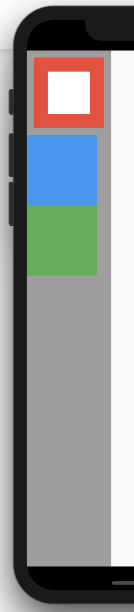
Container
일반적인 페인팅과 사이징, 포지셔닝을 조합하기에 편리한 위젯입니다. margin, padding, width, height, constraints, alignment, color, foregroundColor 등의 속성을 가집니다.
Scaffold(
  body: DecoratedBox(
    decoration: BoxDecoration(color: Colors.grey),
    child: Column(
      crossAxisAlignment: CrossAxisAlignment.start,
      children: <Widget>[
        Container(
          margin: EdgeInsets.all(10),
          padding: EdgeInsets.all(20),
          width: 100,
          height: 100,
          color: Colors.red,
          child: Container(color: Colors.white),
        ),
        Container(width: 100, height: 100, color: Colors.blue),
        Container(width: 100, height: 100, color: Colors.green),
      ],
    ),
  ),
)
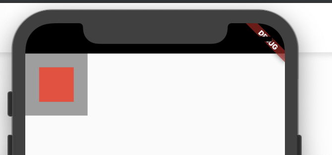
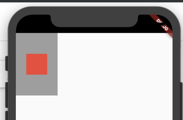
Padding
자식을 감싸서 패딩을 줍니다.
Scaffold(
  body: DecoratedBox(
    decoration: BoxDecoration(color: Colors.grey),
    child: Padding(
      padding: EdgeInsets.all(20),
      child: Container(width: 50, height: 50, color: Colors.red),
    ),
  ),
)
왜 Container 대신에 Padding을 사용하나요? Padding과 Container.padding의 차이는 없지만 Container는 Padding 및 여러 다른 위젯들의 조합이므로 build 될 때 비용이 더 많이 듭니다. 따라서 Padding 속성만 필요할 때 Padding을 사용하면 build 비용을 줄일 수 있습니다.
Center
자식을 감싸서 중앙 정렬 시킵니다. widthFactor, heightFactor값이 있으면 거기에 맞춰서 Center의 크기가 정해지고 (예를 들어, widthFactor가 2이고 자식 width가 10이면 Center의 width는 20이 됨), 그렇지 않으면 가능한한 최대의 크기를 가집니다.
Scaffold(
  body: DecoratedBox(
    decoration: BoxDecoration(color: Colors.grey),
    child: Center(
      widthFactor: 2,
      heightFactor: 3,
      child: Container(width: 50, height: 50, color: Colors.red),
    ),
  ),
)
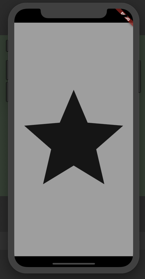
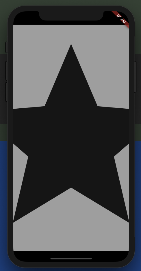
FittedBox
fit 속성값에 따라 자식의 크기비율과 위치를 부모에게 맞춥니다.
Scaffold(
  body: Container(
    color: Colors.grey,
    height: double.infinity,
    child: FittedBox(
      fit: BoxFit.contain,
      child: const Icon(Icons.star, size: 100000),
    ),
  ),
)
Scaffold(
  body: Container(
    color: Colors.grey,
    height: double.infinity,
    child: FittedBox(
      fit: BoxFit.fitHeight,
      child: const Icon(Icons.star, size: 100000),
    ),
  ),
)
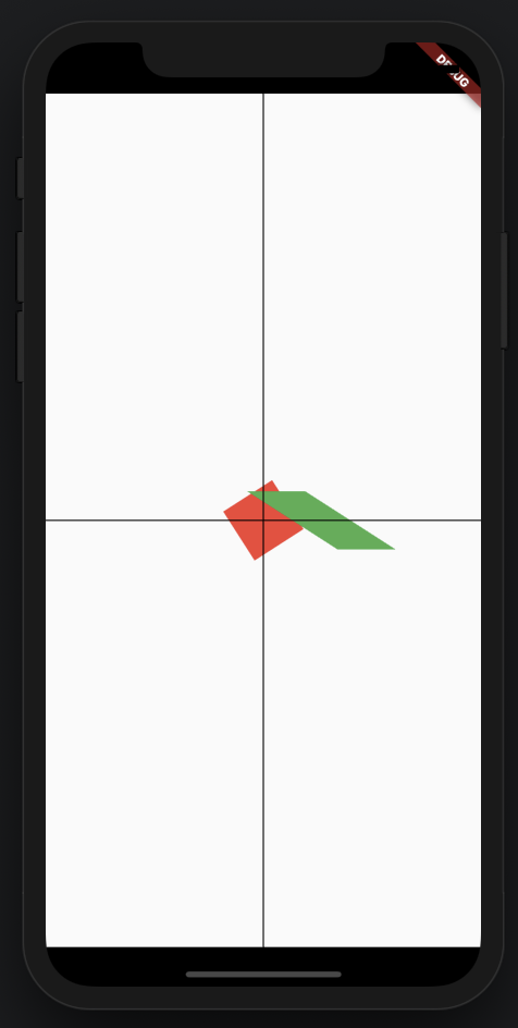
Transform
페인팅 시점에 자식을 변형시킵니다. (실제로 위치나 모양이 바뀌는 것은 아닙니다)
Scaffold(
  body: Stack(
    alignment: Alignment.center,
    children: <Widget>[
      Transform(
        alignment: Alignment.center,
        transform: Matrix4.rotationZ(1.0),
        child: Container(width: 50, height: 50, color: Colors.red),
      ),
      Transform(
        alignment: Alignment.center,
        transform: Matrix4.skewX(1.0)..translate(50.0),
        child: Container(width: 50, height: 50, color: Colors.green),
      ),
      Container(height: double.infinity, width: 1, color: Colors.black),
      Container(height: 1, width: double.infinity, color: Colors.black),
    ],
  ),
)
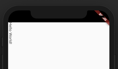
RatatedBox
페인팅 시점에 자식을 네 방향 중 하나로 회전시킵니다.
Scaffold(
 body: RotatedBox(
   quarterTurns: 1, // 0, 1, 2, 3
   child: const Text('Hello World!'),
 ),
)
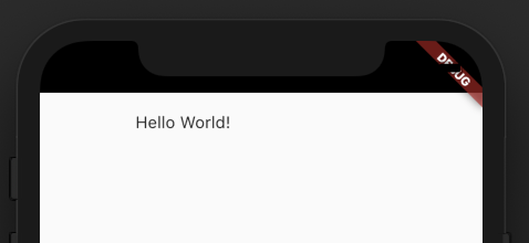
FractionalTranslation
페인팅 시점에 자식의 크기의 설정된 비율만큼의 거리를 이동시킵니다.
Scaffold(
  body: FractionalTranslation(
    translation: Offset(1, 1),
    child: const Text('Hello World!'),
  ),
)
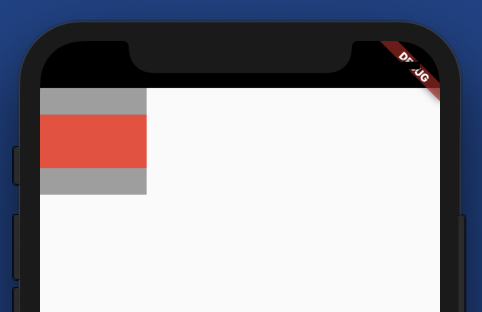
AspectRatio
부모 영역 안에서 자식의 크기를 설정된 가로세로 비율로 맞춥니다.
Scaffold(
  body: Container(
    alignment: Alignment.center,
    color: Colors.grey,
    height: 100,
    width: 100,
    child: AspectRatio(
      aspectRatio: 2/1,
      child: Container(color: Colors.red)
    ),
  ),
)
[Baseline]
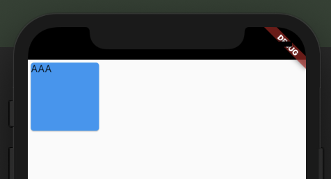
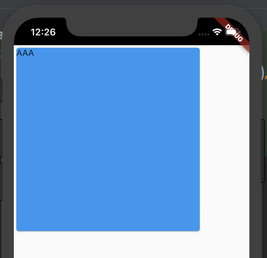
ConstrainedBox
자식의 크기에 제약조건을 줄 때 사용합니다.
ConstrainedBox(
    constraints: BoxConstraints(
      minWidth: 300,
      maxWidth: double.infinity,
      minHeight: 300,
      maxHeight: double.infinity,
    ),
    child: Card(color: Colors.blue, child: Text('AAA')),
  )
UnconstrainedBox

[LimitedBox]
[Offstage]
[OverflowBox]
SizedBox
- as ConstrainedBox
- ListView에서 item spacing 역할
- as invisible(gone) - 위젯을 감출 때도 무조건 위젯을 반환해야 하는데 이럴 때 사용, 예를 들면
isVisible ? Icon(Icons.star, size: 150) : const SizedBox(),const SizedBox는 매우 저렴합니다.
SizedBox(
    width: 300,
    height: 300,
    child: Card(color: Colors.blue, child: Text('AAA')),
  )